
|
Feature |
jQuery |
AJAX |
|
What is it? |
A JavaScript library. |
A technique to get/send data from a server. |
|
Purpose |
Makes JavaScript coding easier. |
Updates web pages without reloading. |
|
Usage |
Used for animations, event handling, and AJAX. |
Used to fetch/send data asynchronously. |
|
Works With |
JavaScript, HTML, CSS, and AJAX. |
JavaScript, jQuery, Fetch API. |
|
Asynchronous? |
Supports AJAX but is not only for it. |
Always used for asynchronous data exchange. |
What is a jQuery Plugin?
A
jQuery plugin is a small add-on that extends the features of jQuery. It
allows developers to add special functions to a website without writing
a lot of code from scratch.
Why Use jQuery Plugins?
- Saves
time – No need to write everything from the beginning.
- Easy
to use – Works with just a few lines of code.
- Reduces
errors – Prebuilt solutions ensure fewer
mistakes.
- Works
on all browsers – No need to worry about compatibility.
How to Use a jQuery Plugin
Step 1: Add jQuery to Your Webpage
Before
using a plugin, include the jQuery library in your HTML file:
<head>
<script
src="https://code.jquery.com/jquery-3.6.0.min.js"></script>
</head>
Step 2: Include the Plugin File
Every
plugin has a JavaScript file. You need to add it to your project:
<head>
<script src="path-to-plugin.js"></script>
</head>
Step 3: Activate the Plugin
Once
the plugin is added, you can enable it using jQuery:
<script>
$(document).ready(function() {
$("#example").pluginName();
});
</script>
Popular jQuery Plugins with Examples
1. Slick Slider (Image Carousel Plugin)
- What
it does: Adds a slideshow for images.
- How
to use it:
<link
rel="stylesheet" type="text/css" href="https://cdn.jsdelivr.net/npm/slick-carousel/slick/slick.css"/>
<script
src="https://cdn.jsdelivr.net/npm/slick-carousel/slick/slick.min.js"></script>
<div
class="slider">
<div><img
src="image1.jpg" alt="Image 1"></div>
<div><img
src="image2.jpg" alt="Image 2"></div>
</div>
<script>
$(document).ready(function(){
$('.slider').slick();
});
</script>
2. Lightbox (Image Popup Viewer)
- What
it does: Opens images in a pop-up window.
- How
to use it:
html
CopyEdit
<link
rel="stylesheet"
href="https://cdnjs.cloudflare.com/ajax/libs/lightbox2/2.11.3/css/lightbox.min.css">
<script
src="https://cdnjs.cloudflare.com/ajax/libs/lightbox2/2.11.3/js/lightbox.min.js"></script>
<a
href="image.jpg" data-lightbox="gallery"><img
src="thumbnail.jpg"></a>
3. DataTables (Table Sorting and Filtering Plugin)
- What
it does: Makes HTML tables interactive by adding
sorting and search features.
- How
to use it:
html
CopyEdit
<link
rel="stylesheet" href="https://cdn.datatables.net/1.11.5/css/jquery.dataTables.min.css">
<script
src="https://cdn.datatables.net/1.11.5/js/jquery.dataTables.min.js"></script>
<table
id="example">
<thead>
<tr><th>Name</th><th>Age</th><th>Country</th></tr>
</thead>
<tbody>
<tr><td>John</td><td>25</td><td>USA</td></tr>
<tr><td>Jane</td><td>30</td><td>UK</td></tr>
</tbody>
</table>
<script>
$(document).ready(function() {
$('#example').DataTable();
});
</script>
4. jQuery Validation (Form Validation Plugin)
- What
it does: Checks form inputs before they are
submitted.
- How
to use it:
html
CopyEdit
<script
src="https://cdnjs.cloudflare.com/ajax/libs/jquery-validate/1.19.5/jquery.validate.min.js"></script>
<form
id="myForm">
<input type="text"
name="username" required>
<input type="submit"
value="Submit">
</form>
<script>
$(document).ready(function() {
$('#myForm').validate();
});
</script>
How to Create Your Own jQuery Plugin
You
can also build your own jQuery plugin. Here is a simple example that changes
the text color of an element:
js
CopyEdit
(function($)
{
$.fn.changeColor = function(color) {
this.css("color", color);
return this;
};
}(jQuery));
How to use it:
$(document).ready(function(){
$("h1").changeColor("blue");
});
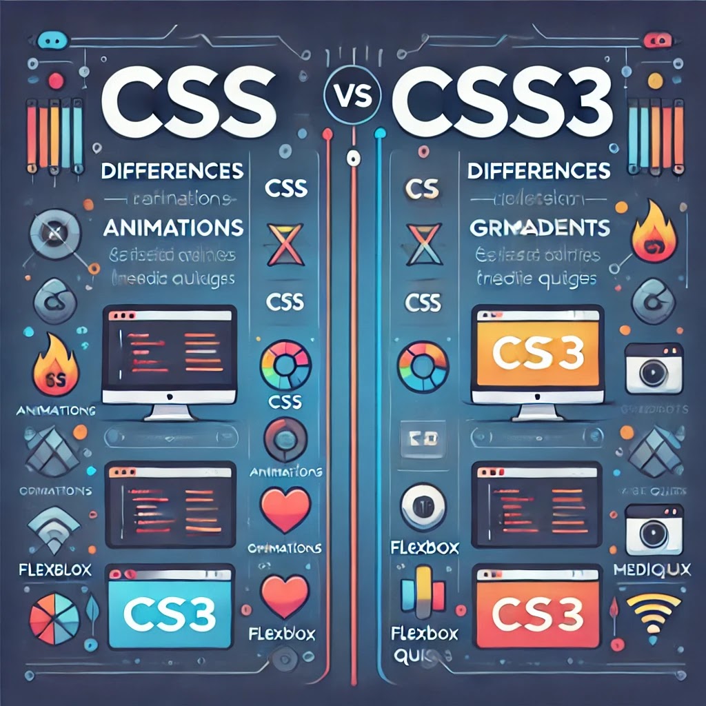
CSS3 vs CSS
CSS
(Cascading Style Sheets) is used to style web pages. CSS3 is the latest version
that introduces new features and enhancements.
Key Differences:
1.
Enhanced Styling – CSS3 introduces advanced
styling options like gradients, shadows, and text effects.
2.
Animations & Transitions – CSS3 allows smooth animations
and transitions without JavaScript.
3.
Flexbox & Grid – CSS3 provides better layout
control using Flexbox and Grid systems.
4.
Responsive Design – Media queries in CSS3 help
create mobile-friendly designs.
5.
Improved Performance – CSS3 reduces dependency on
images and scripts, making pages load faster.
Difference Between CSS and
CSS3
|
Feature |
CSS (Older Versions) |
CSS3 (Latest Version) |
|
Version |
Basic styling and layout |
Advanced styling with new features |
|
Animations |
Not supported |
Supports animations and transitions |
|
Layouts |
Uses float and positioning |
Introduces Flexbox and Grid for better layouts |
|
Borders & Effects |
Simple borders and no effects |
Rounded borders, shadows, and text effects |
|
Media Queries |
Not available |
Allows responsive design for different screen sizes |
|
Performance |
Requires more images and scripts |
Reduces dependency on images, improving speed |
Adding Borders and
Backgrounds in CSS3
Adding Borders and Backgrounds in CSS3
In
this guide, we'll explore all methods of adding borders and backgrounds
in CSS3 with detailed explanations and simple examples.
1. CSS3 Borders
Borders
help to define the outer boundary of an element. They can have different
styles, thicknesses, and colors.
Method 1: Basic Border
Code:
Css
.box1 {
border: 3px solid blue;
}
Explanation:
- border:
3px solid blue; → Adds a solid blue border with a thickness of
3px around the element.
Example:
html
<div class="box1">This is a
bordered box</div>
Method 2: Border for Each Side
Code:
css
.box2 {
border-top: 5px solid red;
border-right: 3px dashed blue;
border-bottom: 2px dotted green;
border-left: 4px double black;
}
Explanation:
- border-top:
5px solid red; → Red solid border on the top (5px thick).
- border-right:
3px dashed blue; → Blue dashed border on the right (3px thick).
- border-bottom:
2px dotted green; → Green dotted border on the bottom (2px thick).
- border-left:
4px double black; → Black double border on the left (4px thick).
Example:
<div class="box2">Different
borders on each side</div>
Method 3: Rounded Borders (border-radius)
Code:
.box3 {
border: 2px solid black;
border-radius: 15px;
}
Explanation:
- border-radius:
15px; → Rounds the corners of the element.
Circular Shape:
.circle {
width: 100px;
height: 100px;
border-radius: 50%;
border: 3px solid purple;
}
- border-radius:
50%; → Makes the element circular.
Example:
<div class="box3">Rounded
Corners</div>
<div
class="circle"></div>
Method 4: Border with Shadow (box-shadow)
Code:
.box4 {
border: 2px solid gray;
box-shadow: 5px 5px 10px rgba(0, 0, 0, 0.5);
}
Explanation:
- box-shadow:
5px 5px 10px rgba(0, 0, 0, 0.5);
- 5px
5px → Adds shadow to the right and bottom.
- 10px
→ Blur effect.
- rgba(0,
0, 0, 0.5); → Black shadow with 50% transparency.
Example:
<div class="box4">Box with
Shadow</div>
Method 5: Border Image (border-image)
Code:
.box5 {
border: 10px solid;
border-image: url('border.png') 30 stretch;
}
Explanation:
- border-image:
url('border.png') 30 stretch; → Uses an image as a border.
Example:
<div class="box5">Border with
an Image</div>
2. CSS3 Backgrounds
CSS
backgrounds improve the look of elements with colors, images, gradients, and
multiple layers.
Method 1: Background Color
Code:
.box-bg1 {
background-color: lightblue;
}
Explanation:
- background-color:
lightblue; → Sets the background color to light blue.
Example:
<div class="box-bg1">Background
Color Example</div>
Method 2: Background Image
Code:
.box-bg2 {
background-image: url('background.jpg');
background-size: cover;
background-repeat: no-repeat;
background-position: center;
}
Explanation:
- background-image:
url('background.jpg'); → Sets an image as a background.
- background-size:
cover; → Ensures the image covers the full area.
- background-repeat:
no-repeat; → Prevents repeating the image.
- background-position:
center; → Centers the background image.
Example:
<div class="box-bg2">Background
Image Example</div>
Method 3: Background Gradient
Linear Gradient:
.box-bg3 {
background: linear-gradient(to bottom, red, yellow);
}
Radial Gradient:
.box-bg4 {
background: radial-gradient(circle, red, yellow, green);
}
Explanation:
- linear-gradient(to
bottom, red, yellow); → Creates a smooth transition from red to
yellow.
- radial-gradient(circle,
red, yellow, green); → Creates a circular gradient from red to
green.
Example:
<div class="box-bg3">Linear
Gradient</div>
<div class="box-bg4">Radial
Gradient</div>
Method 4: Multiple Background Images
Code:
.box-bg5 {
background: url('image1.png'), url('image2.png');
background-size: contain, cover;
background-position: top left, center;
background-repeat: no-repeat;
}
Explanation:
- Uses
two images as backgrounds.
- background-size:
contain, cover; → Sets different sizes for each image.
Example:
<div class="box-bg5">Multiple
Backgrounds</div>
Method 5: Background Clipping (background-clip)
Code:
.box-bg6 {
background: url('pattern.jpg');
background-clip: content-box;
}
Explanation:
- background-clip:
content-box; → Shows the background only inside content.
Example:
html
CopyEdit
<div
class="box-bg6">Clipped Background</div>
Complete Example: Borders & Backgrounds Together
<!DOCTYPE html>
<html lang="en">
<head>
<meta charset="UTF-8">
<meta name="viewport" content="width=device-width,
initial-scale=1.0">
<title>CSS Borders & Backgrounds</title>
<style>
.box {
border: 5px dashed red;
border-radius: 15px;
background: linear-gradient(to right, orange, yellow);
box-shadow: 5px 5px 15px rgba(0, 0, 0, 0.3);
padding: 20px;
text-align: center;
width: 250px;
}
</style>
</head>
<body>
<div class="box">Styled Box</div>
</body>
</html>


0 Comments