
.png)
CSS Backgrounds
- The CSS background properties are used to add background effects for elements.
- In these chapters, you will learn about the following CSS background properties:
- Background-color
- Background-image
- Background-repeat
- Background-position
- Background-attachment
1.Background-color
- It is used to add background color of an element.
Example :
Body {
Background-color : Blue;
}
Opacity / Transparency
- The Opacity property specifies the opacity/transparency of an element. It can take a value from 0.0 - 1.0. The lower value, the more transparent.
Example :
div { background-color: green; opacity: 0.3;}
<html>
<head>
<title>Background and Opacity Example</title>
<style>
/* Container div with green background and opacity */
div p{
background-color: green;
opacity: 0.3;
}
</style>
</head>
<body>
<h2>CSS Background and Opacity Example</h2>
<!-- Box with a green background and opacity applied -->
<div>
<p>This box has a green background with 30% opacity.</p>
</div>
</body>
</html>
Background Image
- The background-image property specifies an image to use as the background of an element.
- By default, the image is repeated so it covers the entire element.
Example :
body { background-image: url(" ganpat.jpg ");}
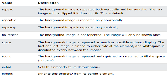
Background Image Repeat
- By default, the Background-Image property repeats an image both horizontally and vertically.
- If the image is repeated only horizontally (background-repeat: repeat-x;) the background will look better.
Example :
body {background-image: url(" ganpat.jpg ");
background-repeat: repeat-x;
}

- By default, the Background-Image property repeats an image both horizontally and vertically.
- If the image is repeated only horizontally (background-repeat: repeat-x;) the background will look better.
Example :
body { background-image: url(" ganpat.jpg ");


Example :
body { background-attachment: fixed; }
Property Values :


- The CSS border properties allow you to specify the style, width, and color of an element's border.
Example :
P {
border-style : solid;
}

- Dotted : Defines a dotted border
- Dashed : Defines a dashed border
- Solid : Defines a solid border
- Doubled : Defines a double border
- Groove : Defines a 3D grooved border. The effect depends on the border-color value.
- Ridge : Defines a 3D ridged border. The effect depends on the border-color value
- Inset : Defines a 3D inset border. The effect depends on the border-color value
- Outset : Defines a 3D outset border. The effect depends on the border-color value


- This property specifies the width of the four borders.
- The width can be set as a specific size (in px, pt, cm, em, etc) or by using one of the three pre-defined values: thin, medium, or thick:
Example :
p { border-style: solid;
border-width: 5px;
border-width: 5px 20px; /* 5px top and bottom, 20px on the sides */}

1. CSS Margins

▶ With CSS, you have full control over the margins. There are properties for setting the margin for each side of an element (top, right, bottom, and left).
hello
2. CSS Padding
▶ Padding-bottom
▶ Padding-right
▶ Padding-left


1. CSS Text
- CSS has a lot of properties for formatting text.
- Text Color : This property is used to set the color of the text.
- The color is specified by
- body { color : red; }
- This property is used to set the horizontal alignment of a text.
- A text can be left or right aligned, centered, or justified.
H1{
2.Text-Decoration:
- Underline: A line beneath the text, often used for emphasis or hyperlinks.
- Example:
- CSS:
text-decoration: underline;
Overline: A line placed above the text, though less commonly used than underlining.
- Example: This is overlined text.
- CSS:
text-decoration: overline;
None: Removes any text decoration, often used to remove default link underlines.
- CSS:
text-decoration: none;
3.Text Transformation
Text transform refers to the CSS property that changes the capitalization or appearance of text. It’s commonly used to control how text is displayed without altering the underlying HTML or actual content. The most commonly used text-transform values are:
Uppercase: Converts all letters to uppercase (capital) letters.
- Example: THIS IS UPPERCASE TEXT.
- CSS:
text-transform: uppercase;
Lowercase: Converts all letters to lowercase.
- Example: this is lowercase text.
- CSS:
text-transform: lowercase;
Capitalize: Capitalizes the first letter of each word.
- Example: This Is Capitalized Text.
- CSS:
text-transform: capitalize;
None: Keeps the text as it is, without changing its capitalization.
- Example: This is default text.
- CSS:
text-transform: none;
This property is helpful for applying styling that needs to conform to a specific format, such as titles or labels.
1. letter-spacing
- Definition: Specifies the space between characters in a text. You can control how much space is added between letters.
- Syntax:
letter-spacing: value;valuecan be in units likepx,em,rem, etc. Positive values increase the space, while negative values decrease it. - Example:
letter-spacing: 2px; }
2. line-height
- Definition: Specifies the height of a line. It's useful for controlling the spacing between lines of text.
- Syntax:
valuecan be a number (multiplier of the font size), a unit (e.g.,px,em), or a percentage. - Example:
line-height: 1.5; }
3. text-indent
- Definition: Specifies the indentation of the first line in a block of text.
- Syntax:
valuecan be in units likepx,em, or percentages. - Example:
p {
  text-indent: 30px;
}
4. white-space
- Definition: Specifies how white-space inside an element is handled. It controls whether white-space characters like spaces, tabs, and newlines should be treated as part of the content or ignored.
- Syntax:white-space: normal | nowrap | pre | pre-wrap | pre-line;
- Example:
p {
  white-space: nowrap;
}
5. word-spacing
- Definition: Specifies the space between words in a text.
- Syntax:
word-spacing: value;valuecan be in units likepx,em,rem, etc. - Example:
p {
  word-spacing: 5px;
}


.png&description=Understanding CSS Text Properties: Color, Alignment, Decoration, and Transformation, Css Margins And Padding With Example,CSS Backgrounds:Background-color, Background-image, Background-repeat, Background-position, Background-attachment,css border)
0 Comments